Skip to content
Search …
All
Furniture
Lighting
Homeware
Our Story
Blog
Tuition
Contact
Log In
Search …
Main Menu
Shop All
Christmas
Our Story
Blog
Tuition
Contact
Your Account
Your Items
Help
News
Archive of press releases for Webb & Gray.
Filter posts by category
All
Events
News
Press
Products & Process
Trends
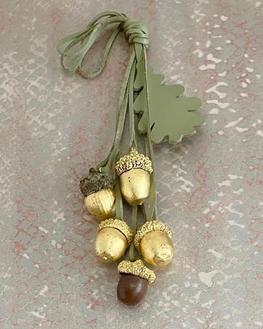
Gilded Acorns: Collaborating with Michele Haynes & Louise Heighes
Selling a Vintage Drinks Trolley the Old-Fashioned Way | A Personal Customer Experience
GPSR Statement for our EU Customers
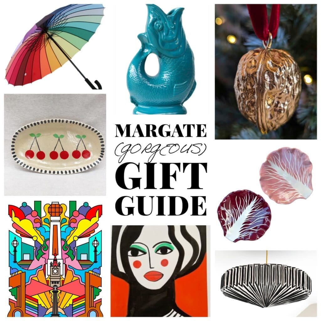
Margate Christmas Gift Guide
Christmas Giveaway – Win a Gilded Walnut
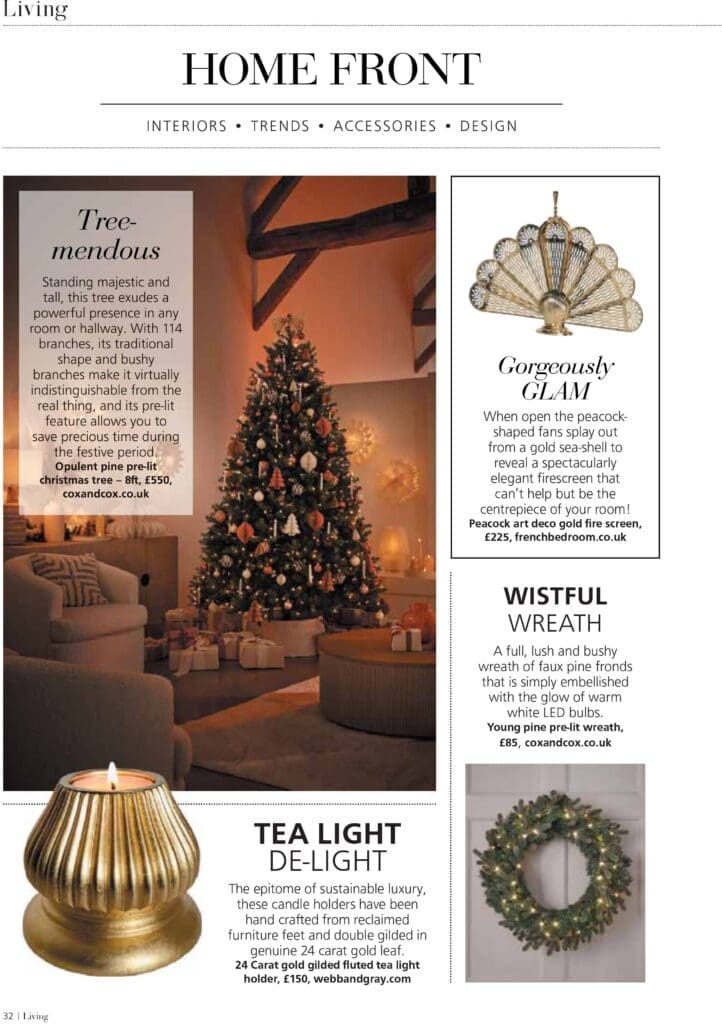
Living Magazine – Interiors Trends Christmas 2024
Reclaim Magazine – 3 Christmas Decor Themes
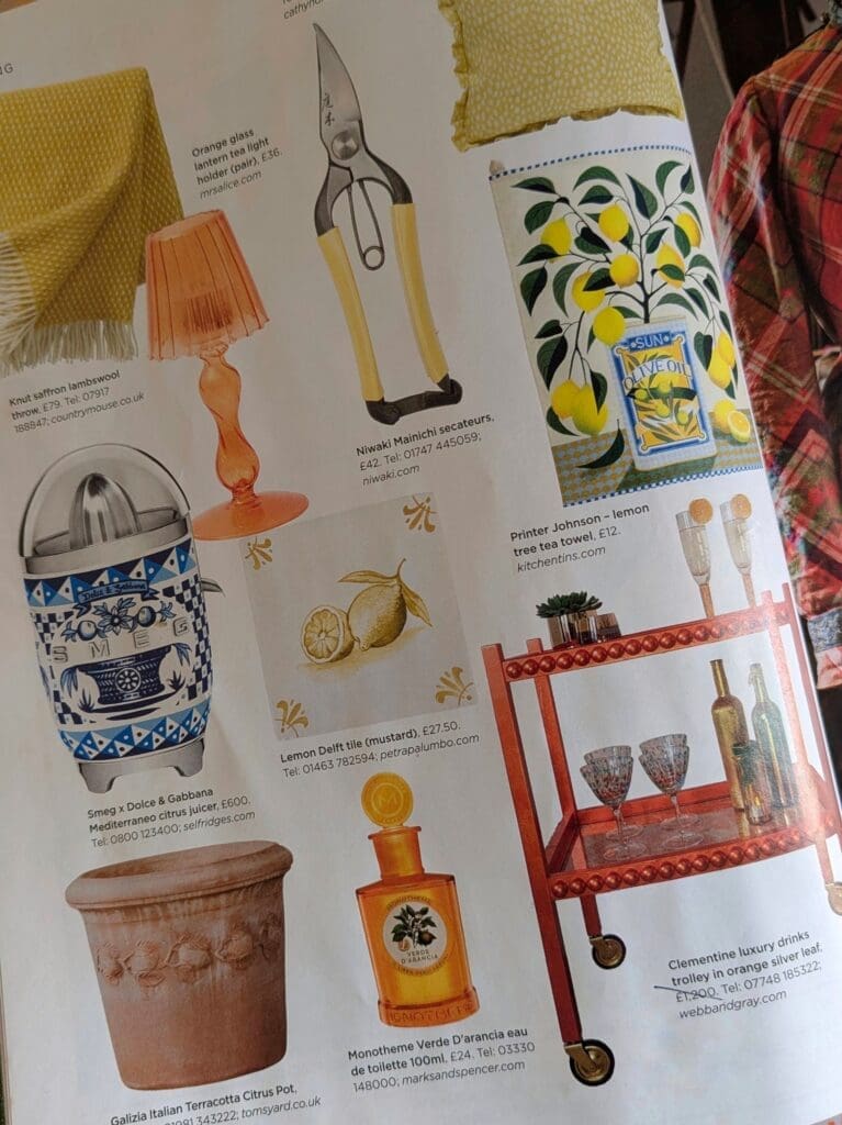
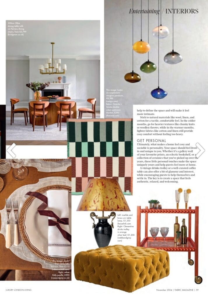
Fabric Magazine – Entertaining Interiors
1
2
…
8
Next
→
Shopping Basket